The main event of the 2024 Typographics festival is a conference with speakers from around the world, focused on the contemporary use of type. It takes place June 14–15 at Cooper Union in New York City.
The main Typographics conference will feature an international line-up of designers, with presentations about type and its use in graphic design, web design, publication design, book design, packaging, branding, corporate identities, advertising, motion graphics, and more.
Founded in 1992 by Michaël Amzalag and Mathias Augustyniak, M/M (Paris) has been defying all forms of categorization for over 30 years. As practitioners of the image, they have together pushed back the boundaries of graphic design through their projects at the intersection of different fields of creation. By collaborating with contemporary artists, musicians, fashion designers and brands, photographers, directors and theatres; and by having redesigned numerous magazines, M/M have been building a visual atlas of the creative landscape since the early 1990s.
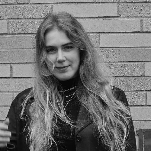
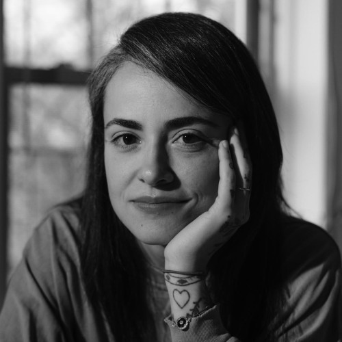
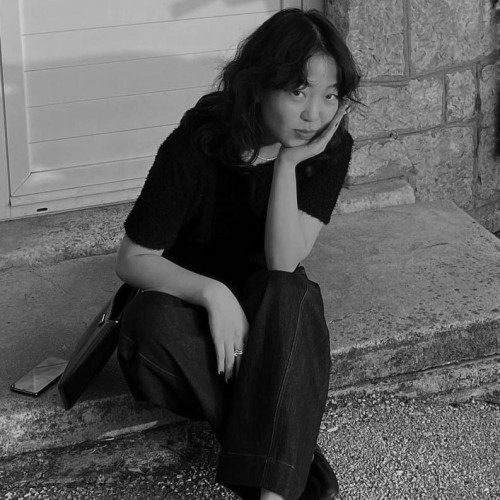
What role do design and typography play in shaping stories and making them accessible to a wide audience? Tala will share her experience crafting visual presentations for publications ranging from small independent titles to her current work at The New York Times.
About Tala Safié
Tala Safié is a graphic designer and art director based in Brooklyn. She currently works as a graphics and multimedia editor at The New York Times. Previous collaborations include AIGA Eye on Design, Journal Safar, The Smudge, and other independent publications and brands based in New York and Beirut.
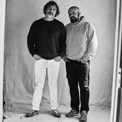
Notes on Authentic Sans, a typeface intended for situations where Oriya Sangam MN seems too sophisticated and LiHei Pro too vulgar, or vice versa. Authentic Sans explores the semiotic and aesthetic idiosyncrasies of the anonymous Latin glyphs included with CJK system fonts; the typeface aims to subvert the Eurocentric standards of typographic quality and refinement. Distributed freely under the WTFPL, Authentic Sans is a reflection of the studio praxis: expanding and redefining the visual and cultural boundaries of default systems.
About AUTHENTIC
AUTHENTIC (Christina Janus and Desmond Wong) is an image-making and typography practice operating at the intersection of graphics, design, language, ideology, culture, and authenticity.
What is the significance of the “stuff” we encounter?
The stuff we collect / hold on to / keep within that brings us back to a place / time / memory?
How does the “stuff” connect us to a larger understanding of —
place, history and ourselves?
How can the “stuff”
serve as access points / stories / forgotten parts to the seemingly mundane?
In short — what is the significance of our material matter?
An exploration of the pervasive, intrinsic and everyday connections between materials and the stories they can offer.
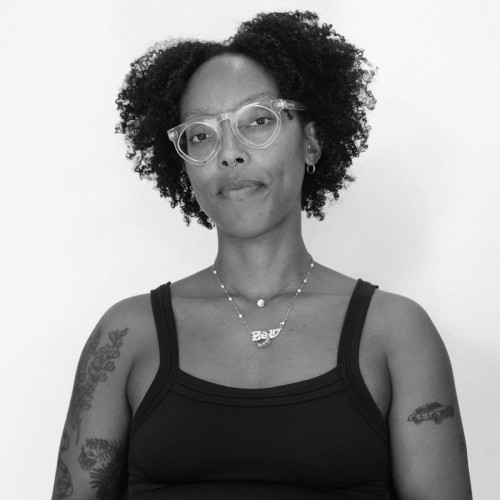
About Zoë Pulley
zoë pulley (b.1993) is a designer and maker who utilizes stuff to surface the seemingly ordinary stories of Black folks through mixed media, typography, and audio. She defines “stuff” as artifacts both physical and nonphysical that may be relegated as unimportant to some—as merely stuff.
Most recently, Pulley has shown work in a group exhibition, Dress Code at the Newport Art Museum and a performance at RISD Museum. Her practice includes ongoing collaborations such as a wearable line inspired by her grandmother called GRAN SANS and a collectively authored publication titled Black Joy Archive. Her work is held in the collections of The Valentine Museum, the Hardvard Radcliffe Institute, and Printed Matter.
She earned a BFA from Virginia Commonwealth University in 2015 and an MFA in graphic design from Rhode Island School of Design. Pulley is an inaugural recipient of the Rhode Island School of Design Society of Presidential Fellowship and was awarded the Graduate Graphic Designer to Watch by GDUSA in 2023. Zoë is currently an Artist-In-Residence at The Studio Museum In Harlem.
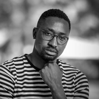
Gen will be sharing stories from his type design journey, highlighting the challenges and rewards of being part of a community striving to open doors for diverse talents. This culture of generosity and openness is driving innovation and growth where formal study opportunities are laking, fostering a more inclusive and supportive future for Mexican type designers.
About Gen Ramírez
Gen Ramírez, a typeface designer and educator based in Guadalajara, Mexico, co-founded Dual Type—a Mexican–Croatian studio specializing in type, editorial, branding, and digital design. His multidisciplinary approach to design has set him on a lifelong exploration of the form and expression of the written word. With a background rooted in sign painting, he’s on a mission to preserve and promote this craft professionally and culturally. Beyond teaching type design and calligraphy, Gen plays a key role in shaping a thriving type community in Mexico, organizing the biennial Letrastica conference in Guadalajara.
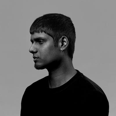
This talk explores recent work by Vera van de Seyp. She has been investigating in what ways emerging (AI) technologies could transform the way we shape and interact with typography, through computational prototypes that focus on different facets of type design. These experiments do not serve as alternatives for current type design tools (or type designers!), but rather aim to explore whether typographic shapes can be created and manipulated more intuitively and with different modes of expression.
About Vera van de Seyp
Vera van de Seyp is a computational designer and educator. Her work explores generative design tools, computational typography, artificial intelligence, and finding systems in chaos. She teaches and gives workshops and lectures about code and developing your own design tools. Currently, Vera is part of MIT Media Lab as a research assistant in the Future Sketches group, where she works on the intersection of AI and graphic / type design tools.
In the Spring of 2024, alongside assistant teacher Shiraz Abdullahi Gallab, I taught “Wayward Sentences” at the School for Poetic Computation. This class explored our relationship to writing, reading, designing, and publishing constraints through collaborative play, lectures, and weekly prompts in code and writing. Through an oral and live annotation of the course, Rasheed will recount the curiosities that bubbled up while facilitating this class. Rasheed will discuss how teaching, a relational practice, also guides her approach to design which is often in collaboration with partners across species, living/death binary, and planes.
About Kameelah Janan Rasheed
A learner, Kameelah Janan Rasheed explores writing practices across all species, states of living, states of consciousness, and substrates. Curious about the poetics and possibilities of loss, ruin, and failure in the reading and writing process, Rasheed is interested in Black knowledge production and fugitivity. She creates sprawling, “architecturally-scaled” installations; public installations; publications; prints; performances; performance scores; poems; video; and other forms yet to be determined. She is an adjunct instructor at the Cooper Union and Barnard College, a Critic at Yale School of Art, Sculpture, and an instructor at the School for Poetic Computation. Rasheed founded Orange Tangent Study, a consulting business that provides artist microgrants and supports individuals and institutions in designing expansive and liberatory learning experiences.
This talk presents research on the development of a “chop suey” typeface called “1882–1982–2019,” arguing that this ostensibly “Asian” genre of typography is, in fact, preeminently American. It explores typography’s capacity to narrate historical phenomena and challenges the notion that typography, as a craft and technology, is value-neutral.
Building on Benedict Anderson’s concept of the “Imagined Community,” which links typography, printing, and nation-building, this project examines typography’s corollary role in the process of “racialization” as defined by race scholars Michael Omi and Howard Winant. The aim is to understand typography’s participation in nation-building and its implications for emerging, yet persistent ideas about labor and progress.
Through a type design derived from historical illustrations, advertising sources, and AI-generated forms, “1882–1982–2019” traces how “chop suey” fonts have contributed to settler-colonialism, the construction of “the West,” and the normative, occidental boundaries of typography. The project highlights how the history of anti-Chinese and broader anti-Asian sentiment over the past 150 years has influenced assumptions about validity, correctness, and progress in typography, graphic design, and labor today.
About Chris Lee
Chris Lee is a graphic designer and educator based in Lenapehoking (Brooklyn, NY), where he is an Assistant Professor at the Pratt Institute in the Undergraduate Communications Design Department. He graduated from OCADU (Toronto) and the Sandberg Instituut (Amsterdam), and has worked for The Walrus Magazine, C Magazine, Metahaven and Bruce Mau Design. He was also the designer and an editorial board member of the journal Scapegoat: Architecture/Landscape/Political Economy. Chris is the author of Immutable: Designing History, which explores graphic design’s entanglements with the development and perpetuation of capitalism and colonialism. It is published by Onomatopee/Library Stack.
Queer communication has historically been left to the margins, relying on subversive messaging, hidden-in-plain-sight visual languages, and clandestine signals. With more recent mainstream representation comes more fervent backlash, and with it, the question of how one can use queerness as an active, transformative tool to navigate an often hostile world. How can a binary thing like type embrace a more fluid, inclusive, and authentic model prioritizing expression, community, and inclusivity? And how many rhinestones are too many?
About Kyle Letendre
Kyle Letendre is a freelance designer based in Portland, Oregon, specializing in lettering, type design and illustration. Like a rhinestoned Swiss Army Knife, their work blurs the lines between type and image and has attracted collaborations with clients such as Target, Penguin Random House, Mercedes-Benz, New Belgium Beer, and Sports Illustrated. Beyond the bureau, Kyle’s love of sharp lines and exaggerated shapes turn into their drag persona, Tomboy, an androgynous fashion sketchbook come to life.
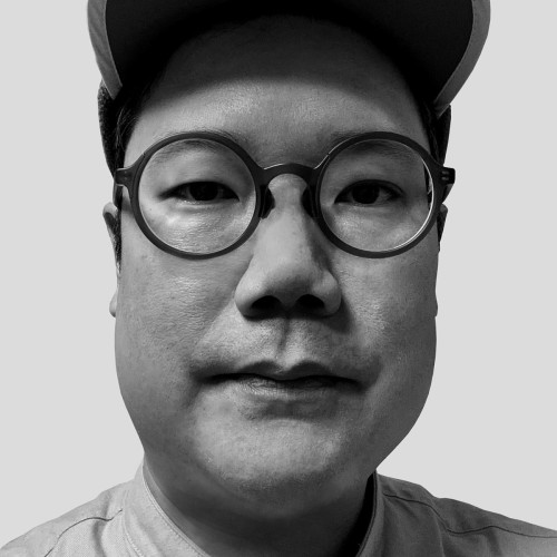
Studying type design at Type@Cooper changed how Andrea thinks about graphic design. Type designers honor their sources—something graphic designers often neglect. He learned to slow down and consider why we use certain forms, colors, and fonts, and where they have appeared before. Type design also taught him about commitment (the courage to tackle a big project) and exploring the extreme ends of any visual spectrum, from super condensed to extra wide.
About Andrea Trabucco-Campos
Andrea Trabucco-Campos is a graphic and type designer whose practice utilizes typography and behavior to build transformative visual identities. An active voice in emerging technologies like AI, his work investigates their role in the design process and culture. His output spans the digital to the material, encompassing brand identities and systems, websites and apps, print and editorial, motion and interaction, signage and environmental, and custom typefaces.
Andrea was born in Colombia, grew up in Italy and now resides in New York. He leverages the experience of his own cultural journey to uncover the essence of others’ identities. Andrea was previously a creative director at Gretel and DesignStudio, and is currently a partner at Pentagram after prior stints as a designer and associate partner in the New York office from 2015-2019. Alongside these roles, he has maintained an independent practice for over a decade, designing identities for theaters and film festivals, award-winning books and websites, and custom typefaces for publications.
Have you ever called design work “bad”? What did you mean? Was it illegible? Underdesigned? Did it draw too much attention to itself? Was it something to do with the designer? The content? The audience? Wait. What about good design? What does that look like? Is it clear? Simple? Just right? How do you know?
Bad Design is an ethos that questions hegemonic standards of universality, clarity, and function, in order to give room for specificity, mess, and uselessness in graphic design. It wants to make you think about what you deem good and how you learned that. So things can change. This lecture will tour popular design conventions, make the case for resisting them, and push forward alternative possibilities for visual representation.
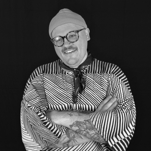
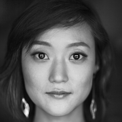
About Luiza Dale
Photo by Yael Malka
Luiza Dale (b. 1988, Rio de Janeiro) is a graphic designer based in Brooklyn, New York. Her work explores (1) how live performance happens in print and digital reproductions and (2) visual representation that pushes against norms of clarity. Luiza designs independently, co-runs the studio The Aliens, and publishes as Quickbooks. She is Lecturer at the Yale School of Art and Rutgers Mason Gross School of the Arts, and Part-time Lecturer at Parsons School of Design. Luiza is currently graphic designer in residence at ISLAA (2023–2024). Starting fall 2024, she will be Assistant Professor at VCUarts. Luiza holds an MFA from the Yale School of Art where she was awarded the Charles Sawyer Prize.
Exploring the philosophy of Doc Saki Mafundikwa, “looking from within.” Much of Mam’Gobozi Design Factory’s work stems from design as a field of creative expression—using graphic design as a decolonial practice of defining the design field for themselves.
About Osmond Tshuma
Osmond Tshuma is a co-founder of Mam’gobozi Design Factory, a playground for creativity, freedom of expression in different forms. The creative studio was founded in 2016, its main focus; to showcase and pave way for African design as international design.
An intersection of technology and play in typography. From graphic design to coding and physical computation, this talk showcases explorations and processes in various fun type projects.
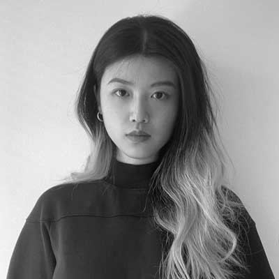
About Rozi Zhu
Rozi Zhu is a multidisciplinary designer based in New York City. With a strong curiosity in technology, she creates experimental visuals and interactive designs.
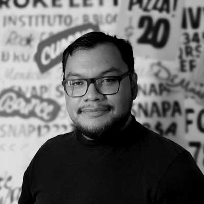
We often think of skills existing in silos, used for specific purposes. However, creative work thrives on cross-pollination. Sanchit’s journey as a type designer has profoundly shaped his approach to image-making, branding, and visual systems. While he traverses these disciplines, his typographic foundation remains a constant companion, influencing every step of the way. This talk explores how this core skill informs his creative process and the unique perspective it brings to his work.
About Sanchit Sawaria
Sanchit Sawaria is an art director and design generalist with a portfolio of work spanning every form of communication; from type design, branding, and publication design to motion, illustration and 3D art. He graduated from the National Institute of Design, Ahmedabad, India in 2012. Since then has worked at Apple Music and Sagmeister & Walsh, and has collaborated with clients such as Google, the New York Times, Absolut, and Samsung. His typographic body of work has been recognised by the Type Directors Club for which he won the TDC Ascenders Award. His work has been featured in publications such as It’s Nice That, Creative Boom and AIGA Eye on Design.
Jingqi thought she knew everything about design—that was until two years ago when an email from “MáLà Project,” a Chinese restaurant brand in New York, landed in her inbox. The challenge? Create a bilingual identity showcasing their rich flavors and cultural heritage. The dilemma? The said bilingual identity. Jingqi is, in fact, Chinese. She speaks Chinese and writes Chinese, but how on earth do you design in Chinese? How do you even begin to pair two completely different languages together?
This talk chronicles her year-long journey of research and design as she delves into the rich visual landscape of China for the very first time—from the imperial era to the 90’s and beyond—all while developing a deep obsession with its letterforms and rediscovering her cultural roots. Weaving together her learnings, Jingqi will illustrate the culmination of her journey through the lens of MáLà Project’s bilingual type system. This talk is about seeing the past anew—where every ending has a new beginning and every return paves a path towards another beautiful discovery.
About Jingqi Fan
Jingqi Fan is a Chinese-born Canadian graphic designer and art director. Currently, she is a senior designer at COLLINS and maintains a personal practice focusing on identities, web, and printed matter. Her work is historically informed and concept-driven—balancing distinction with familiarity and an eye for detail with a playful soul. She has been recognized by the Type Directors Club, Art Directors Club, Tokyo TDC, D&AD, and the Webby Awards, among others. Her work has also been showcased by industry publications like Viction:ary and It’s Nice That. Jingqi holds a BFA from Washington University in St. Louis with a minor in Computer Science and is a recipient of the Jeffrey Frank Wacks Scholarship.
As designers, we all have a love affair with type. It is our love language. Yet, type can be a powerful business tool. Min will share an eclectic mix of approaches on how type can play a crucial role in translating a business strategy into an irrational love for a brand.
About Min Lew
Min Lew is an award-winning executive creative director and managing partner of Base; An international network of creative studios dedicated to creating brands with cultural impact through strategy, design, and digital expertise. A graduate of Yale University where she received her MFA, she brings two decades of experience working in the fields of culture, tech, luxury, and education. A National Design Award nominee, brand work under Min’s leadership includes MoMA, Apple, Museum of Fine Arts, Boston, Harvard University, JFK Terminal 4, Pharrell Williams, Studio Museum in Harlem, NY Times, Meta, MILK, Meatpacking District, and Rock & Roll Hall of Fame among others. She has been serving the design community as a board member of One Club Type Director’s Club, AIGA/NY, NYCxDESIGN, and as an adjunct professor and guest critic at the School of Visual Arts, Parsons, and Pratt.
Talk descriptions and other details will be posted here over the coming days. For updates and announcements, join the Typographics mailing list and follow Typographics on Mastodon and Instagram.
Register
Registration for the main Typographics 2024 conference is now open, with options to attend both in-person and virtually online.
Conference regstration is separate from the Workshops & Tours, TypeLab, or Book Fair. You must register for those events separately.
Pricing
Professional $525*
Standard tickets for professional attendees.
Educator $450*
For college staff, instructors, adjuncts, professors, and public library librarians.
Student $275*
For full-time matriculated students currently enrolled in college. Please be prepared to show valid student ID card at check in.
Small bundle $475/ticket*
For 5–9 professional tickets. These tickets are non-refundable but may be transferred to another person if requested before May 30.
Large bundle $450/ticket*
For 10 or more professional tickets. These tickets are non-refundable but may be transferred to another person if requested before May 30th.
“Pay What You Can” livestream tickets $0–100*
These tickets provides access only to the online livestream for the conference and support our efforts to make events accessible remotely.
* Prices shown before Eventbrite processing fees, which are non-refundable.
Please note: Typographics participants are subject to our Code of Conduct & Policies. If you do not agree to these conditions, do not register or attend any Typographics events.
Stay Updated
More info about this year’s Typographics will be announced in the coming weeks.
Join the mailing list to get the latest news and announcements: